Who should bring the colour into a classroom?
Early learning spaces are often filled with bright colours, graphics and constant visual stimulation. But could a calmer architectural background help children focus, settle and allow their own work and activity to bring the space to life?
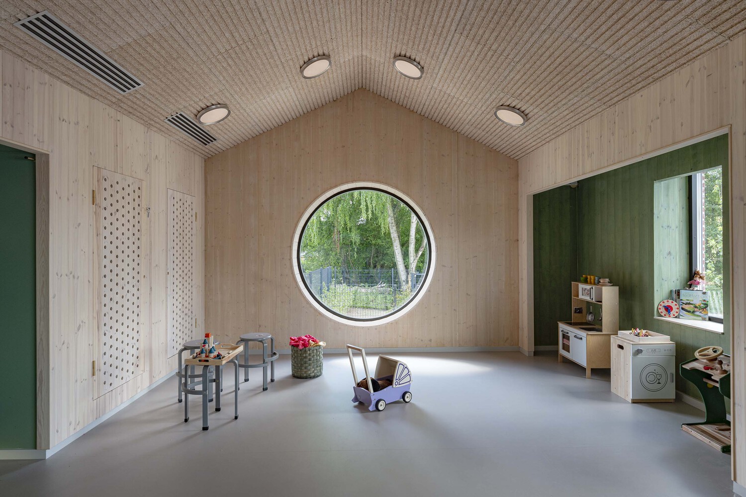
Egedammen Kindergarten (Gladsaxe, Denmark) – BBP Arkitekter
Kindergarten and primary school spaces are often designed to be visually stimulating.
Bright colours, patterns and graphics are applied across walls, floors, ceilings and furniture. The intention is understandable: childhood is associated with imagination, energy and play, so the architecture is expected to express those qualities too. But what happens when the room is already competing for attention before a child has entered it?
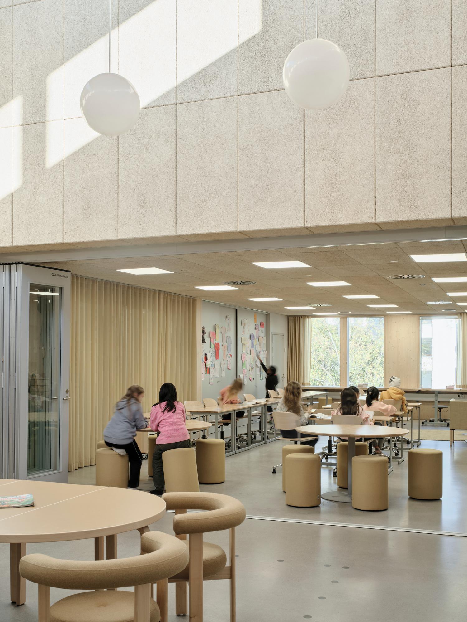
For younger children, concentration and self-regulation are still developing. A visually busy environment may be intended to feel engaging, but the accumulation of colour, signage, decoration, teaching material and furniture can result in everything asking to be noticed at once. Across several Nordic kindergartens and primary schools, a different approach can be seen. Their interiors are often materially warm but visually restrained: pale timber, muted flooring, simple joinery, natural daylight and carefully controlled moments of colour. These spaces are not empty or colourless. Instead, the architecture provides a calm background, allowing the children, their work and the everyday activity of learning to become the changing foreground.
The architecture sets the background.
The distinction is not simply between colourful and colourless classrooms. It is between colour permanently built into the room and colour introduced through children’s work, books, toys, displays and everyday activity. A brightly patterned wall remains the same every day. Children’s drawings, models, notes and collected objects change with the people using the space and with what is being learned. When the architecture is more restrained, these changing elements become easier to see. The room develops its identity through use, rather than arriving visually complete.
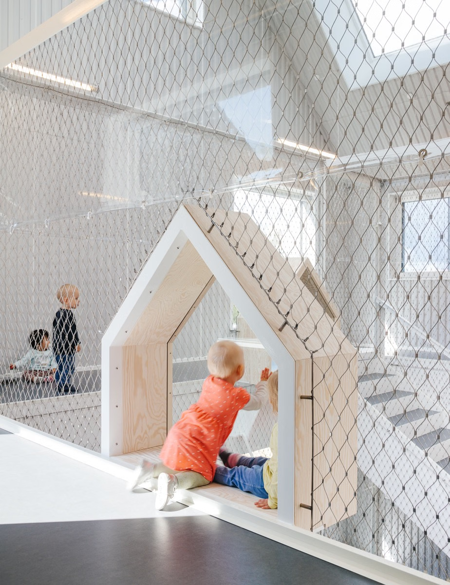
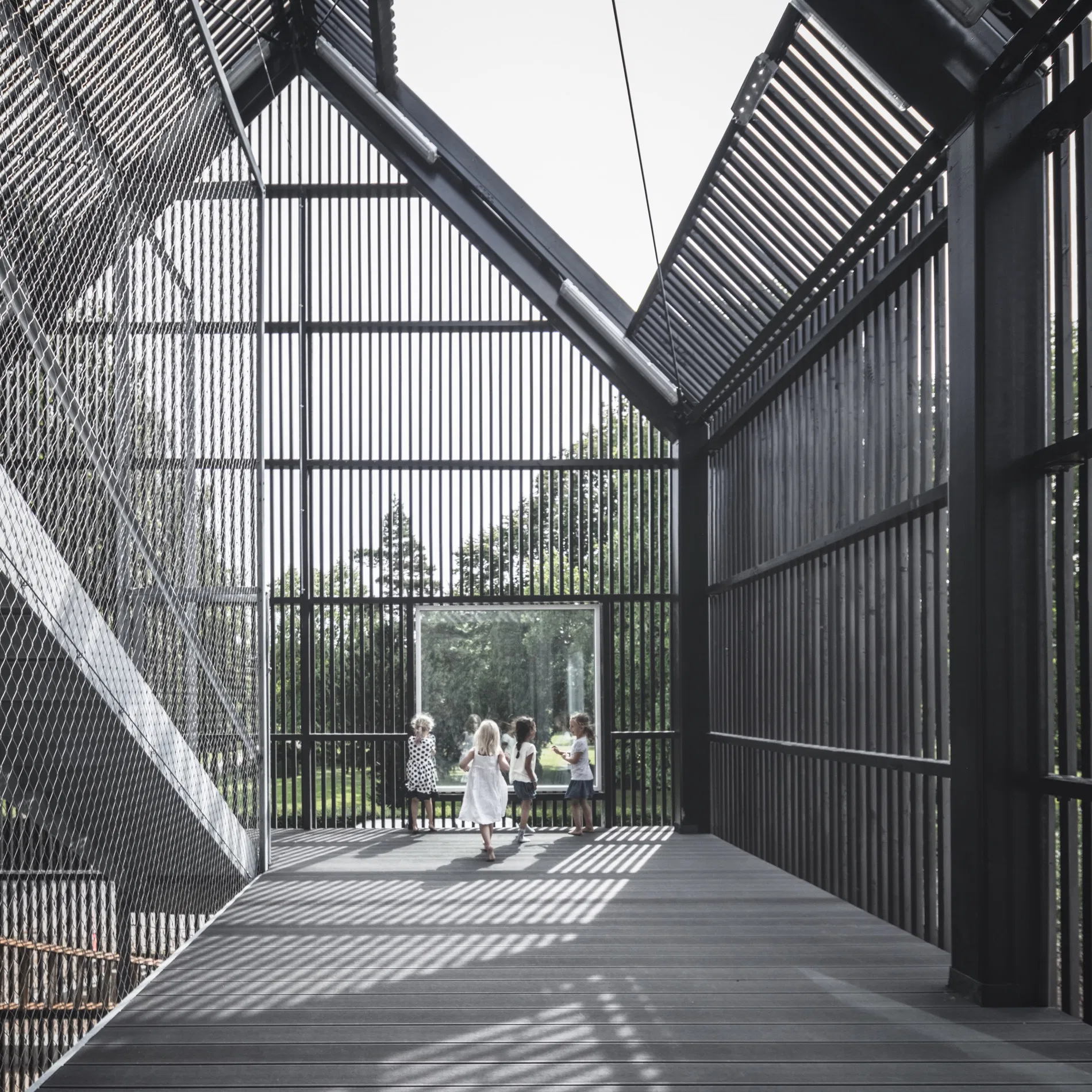
Frederiksvej Kindergarten (Frederiksberg, Denmark) – COBE
Frederiksvej Kindergarten accommodates a large number of children, but the institution is broken down into a collection of smaller, interconnected houses. Its sense of play comes from pitched forms, small openings, niches and changes in scale rather than from a loud decorative palette. The architecture feels clearly designed for children without every surface needing to announce it. The lesson: playfulness can come from space, proportion and form, not only colour.
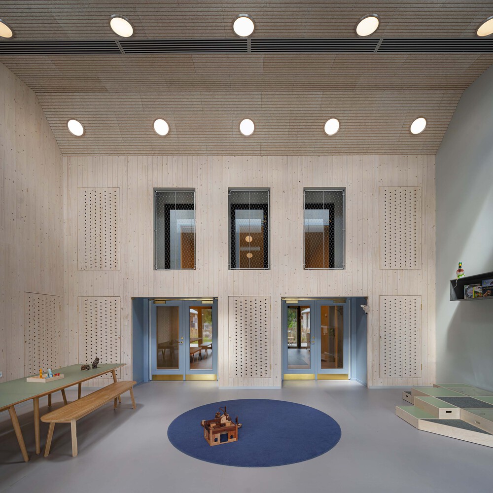
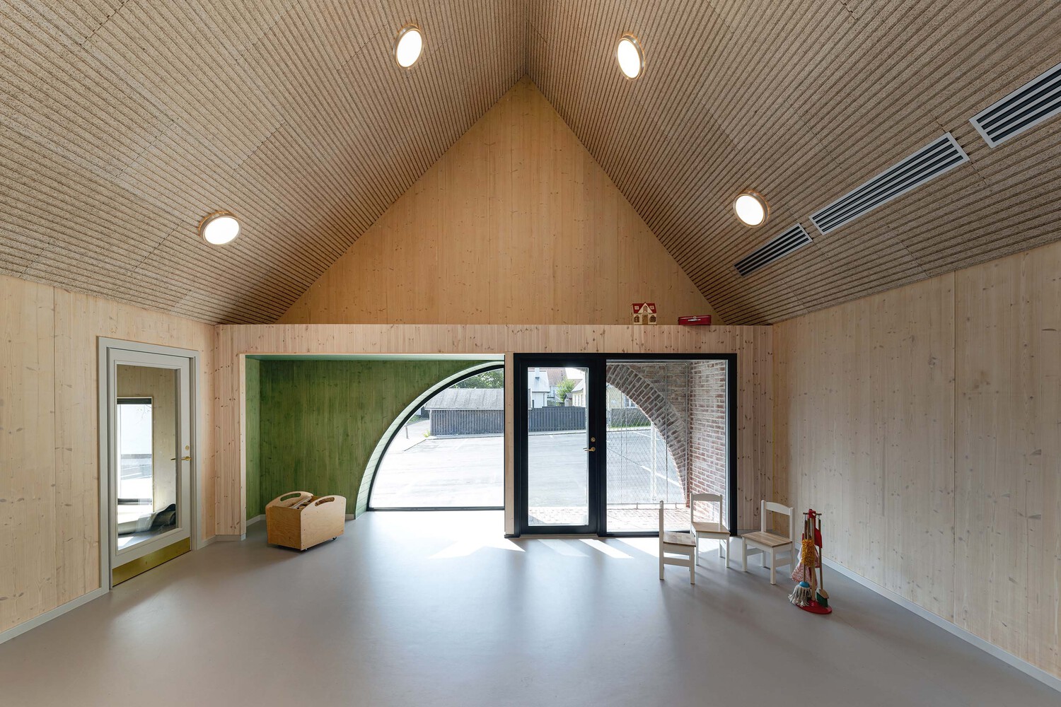
Egedammen Kindergarten (Gladsaxe, Denmark) – BBP Arkitekter
At Egedammen, exposed timber establishes a consistent and tactile interior background. Larger communal areas are balanced by smaller niches and places where children can withdraw while remaining connected to the wider space. Colour is present, but concentrated. Blue and green are used to identify particular areas rather than being spread across every surface. The lesson: colour can support orientation and identity without overwhelming the room.
Maatulli School & Kindergarten (Helsinki, Finland) – Fors Arkitekter, Talli & Blomqvist Arkitektur
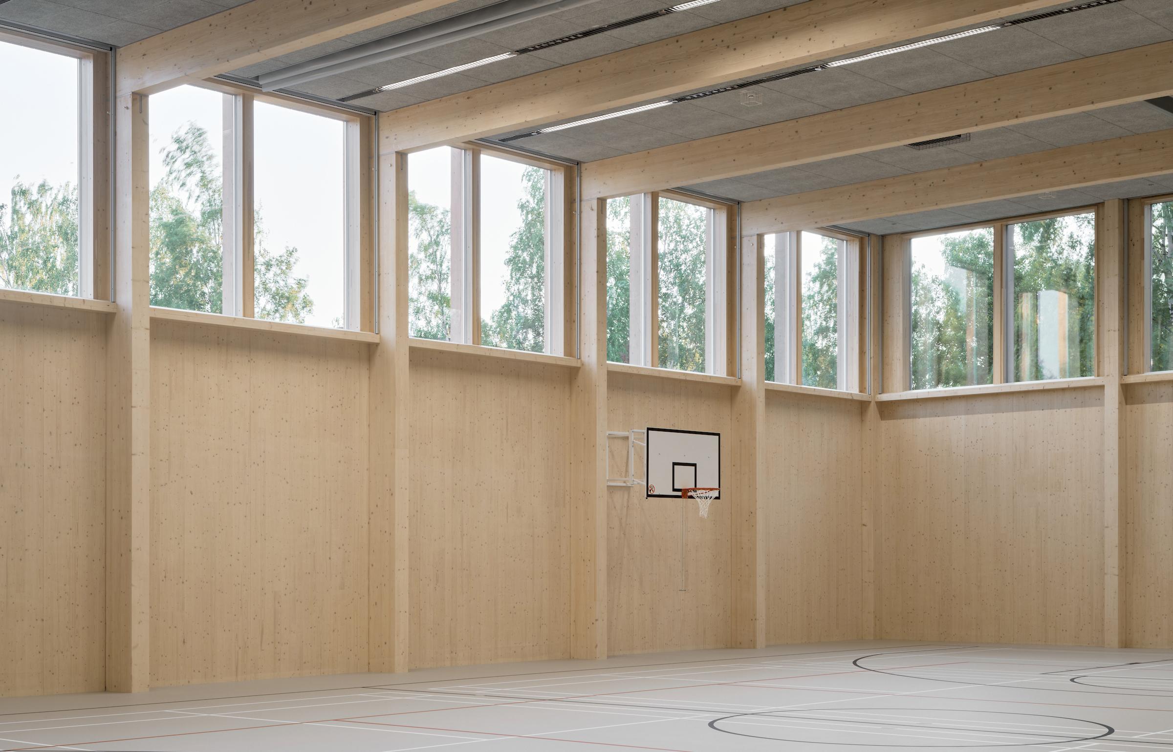
Maatulli brings a primary school and kindergarten together within a group of timber buildings arranged around a central courtyard. Natural materials, timber surfaces and extensive daylight create warmth and continuity across the larger educational environment. The character comes from material texture, landscape, light and occupation rather than a collection of unrelated finishes. The lesson: warmth and character can come from material, light and landscape, without competing for a child’s attention.
This is not an argument for blank or colourless classrooms. Children still need tactile materials, visible resources, accessible storage, areas for making and mess, spaces to gather and smaller places where they can retreat. A calm environment should still be spatially rich, flexible and engaging. The issue is hierarchy.
When coloured floors, graphic walls, acoustic panels, furniture, signage, displays and teaching material all compete equally, the environment can become visually relentless. Each element may make sense individually, but together they create constant background stimulation. The Scandinavian examples suggest another possibility. The permanent architectural layer can provide warmth, clarity and consistency, while the changing life of the classroom provides colour and complexity.
The question is not whether learning spaces should be colourful. Of course they should. The better question is who should bring that colour into the room?
When architecture steps back, children’s artwork, objects, experiments and everyday activity become more prominent. The room changes because the children have changed it. Architecture becomes the calm background.
The children make the room vivid.